



Rebuilding Palette From the Ground Up
When Ulta moved off Sketch and onto Figma, I joined the newly formed Palette design system team to rebuild the core UI library from the ground up: buttons, inputs, cards, the parts nobody notices until they're broken. Working with product, engineering, research, and accessibility partners, and with guidance from Big Medium and Figma, we turned Palette into a system that's consistent across 100+ products, faster to build from, and WCAG-compliant out of the box.
One Owner, Three Surfaces
Sketch's limitations had let near-duplicate components and recipes accumulate across Account, Bag, and Checkout (ABC), the same problems solved three separate times, three different ways. The initial direction was to fold ABC into the default system library. I argued for a separate one instead: those components were vast and hyper-specific, and bundling them in risked a bloated file every other team would have to move through for an ABC-only update.
Making that case took more than one conversation: with the incoming ABC designers, their managers, our product design director, and development, alongside App's ABC designer, who'd also just joined the team. Once they were aligned on the risk, the library was approved and I took ownership of it. My App counterpart stayed on as advisor, since he was moving to other priorities, and I kept the rest of the team looped in as it was built.
Eighteen Components, Three Recipes
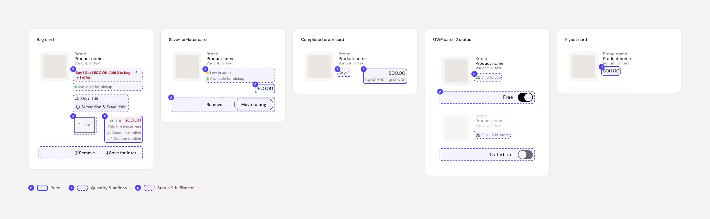
The clearest example is the Product List recipe: a thumbnail, brand, item name, variant, quantity, and price, appearing across Account, Bag, and Checkout, with different logic layered on at each surface. Bag needed quantity selectors, fulfillment options, promo tags, and save-for-later actions; Checkout locked in whatever had already been chosen; Account showed final post-tax pricing and returns. Sketch had let this exist as six separate components on web alone, eighteen once you count the iOS and Android duplicates.
BEFORE · LINE ITEM AUDIT
.avif)
My first attempt consolidated all of it into a single component driven by booleans and dropdowns. It failed pilot testing: designers could select combinations that didn't exist in production, and engineering flagged that the context-switching logic, legible in Figma, was harder to actually build than it looked. The lesson was that an organizational structure that makes sense in Figma doesn't automatically map to how development or Storybook needs the same logic structured. I rebuilt it as three separate recipe sets (Product List: Account, Product List: Bag, Product List: Checkout), selected via a location control that then constrained each set to only the variables relevant to that surface (login state, fulfillment method), which made invalid combinations impossible to select in the first place.
AFTER · LINE ITEM SYSTEM
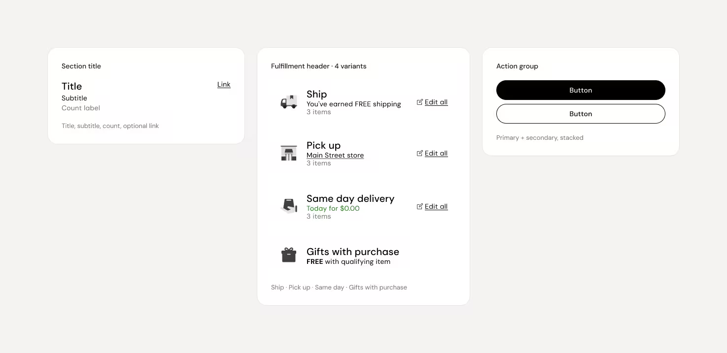
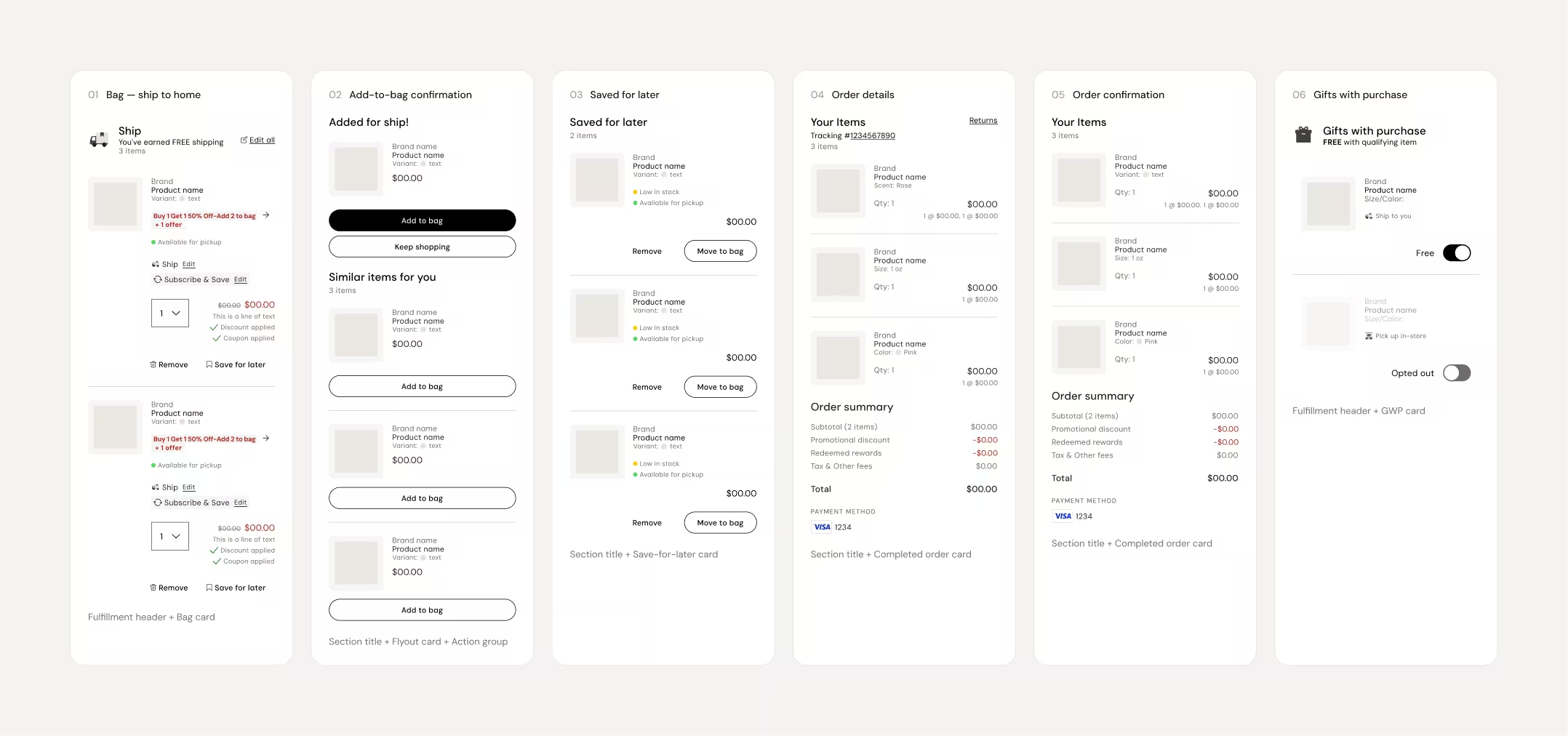
One component didn't fit any of these patterns: the variant-selector list item inside the "add to bag" flyout, which lets a guest pick a size or color directly from a product listing page rather than just displaying a choice already made. PLP, Account and Bag teams both had a claim to it, since the flyout could be triggered from either surface. Rather than force an owner, I created a Shared section within the ABC library for components that crossed channel boundaries. That resolved the ownership question by changing what question we were asking: not whose surface is this, but does this belong to any one surface at all.
A Naming Convention Built to Coexist
Naming conventions were a team-wide decision, but the constraints within the ABC Library was mine to navigate: the new system couldn't mirror existing component naming because that would collide with the slow, phased rollout planned for Palette 2.0. Working with the rest of the design system team, we landed on a four-level structure for components:
Category → Component → Variant → Property/State
Because Account, Bag and Checkout shared similar recipe groups with key differences, I argued recipes within ABC Library needed different logic: naming that communicated purpose, not just hierarchy. For Product List recipes, that meant a channel-first structure. That way, anyone in the file could tell where a component lived and why it existed without opening it. For example: Account → Product List → Purchase History, Bag → Product List → Promotional, etc.
100+ Products, One System
Alongside the consolidation work, I archived outdated assets and opened a standing feedback channel with the Account, Bag, and Checkout designers as adoption rolled out. The result: design consistency across 100+ products, and an accessibility rating increase from 88/100 to 100/100 under WCAG 2.2 according to current third-party reports, since Palette's rollout.

